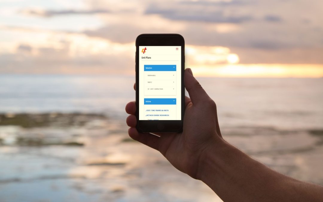
You are going to love the updated version of Curriculum Trak coming this summer! In an earlier post, we mentioned that Curriculum Trak 2.0 will have a responsive design, allowing users to view and work in Curriculum Trak on just about any screen size, from smartphone to the largest computer monitor and anything in between. Two of the key areas we are working to make the most responsive, or easiest to use from a smartphone screen, are the unit plans and the lesson plans. These are areas that busy teachers are most likely to access away from their desks.
The responsive design of these two areas will allow the unit and/or lesson plan to be on a smartphone in a completely collapsed view. Specific fields within the plan can be expanded with a simple tap. Regardless of how many columns of fields may appear in the full-screen view, the smallest screens will rearrange those fields from top to bottom allowing for simple scrolling. Mid-size screens will adapt in a similar way.
We are excited about providing these changes for teachers. If you have any questions or concerns, of if you would like more information about Curriculum Trak 2.0, please contact support.