The Curriculum Mapping Progress Report is a quick way to see which courses contain content, and how much content each course contains. In this report, by default, all of your courses from a single template will be listed with a color coding indicating the amount of progress made in each course. The color coding is based on the total number of units in the course compared against the number of units containing content. Since it is a quantity report (not a quality report), it serves as a good starting point for reviewing your mapping work. We are happy to announce that we have added some additional options for viewing information in this report.
One of the reasons we added this enhancement was to provide for more specific reporting. Several schools had been asking for a way to refine this information to focus more clearly on specific areas of their school curriculum. Now, in addition to breaking down your course list by template, this report can be further refined by either a grade level or a program area, or both. These additional options will provide teachers, administrators, PLCs, grade-level teams or anyone to get a more focused view of mapping progress based on their specific area of responsibility.
Another reason this report was changed is because as schools work to expand their course offerings while working to keep their approach to mapping those courses as standard as possible, the report was struggling to collect all of the data in a timely manner. If your school has more than 200 courses on a single template, you will be required to refine your search to a specific program area or grade. If you would like to revert to more expansive reports, you can simply split your template. Contact support for assistance with that or if you have questions or feedback about this enhancement.
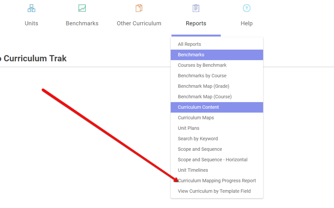
Here is a demonstration about finding and using this report: